同济大学:《应用统计学》课程电子教案(课件讲稿)Chapter 2 Presenting Data in Tables and Charts
Statistics for Managers Using MicrosoftR Excel Chapter 2 Presenting Data in Tables and Charts Statistics for Managers Using Microsoft Excel Chap 2-1
Statistics for Managers Using Microsoft Excel Chap 2-1 Statistics for Managers Using Microsoft® Excel Chapter 2 Presenting Data in Tables and Charts
Learning Objectives In this chapter,you will learn: To develop tables and charts for categorical data To develop tables and charts for numerical data The principles of properly presenting graphs Statistics for Managers Using Microsoft Excel Chap 2-2 Tongji University,School of Economics Management
Statistics for Managers Using Microsoft Excel Chap 2-2 Tongji University, School of Economics & Management Learning Objectives In this chapter, you will learn: To develop tables and charts for categorical data To develop tables and charts for numerical data The principles of properly presenting graphs
Why need tables and charts? >As a general,appropriate tables and charts should be constructed whenever a set of data contains about 20 or more observations. >The important features or characteristics of the data from these tables and charts can be extracted Data are organized and presented in the form of tables and charts in order to enhance data analysis and interpretation Statistics for Managers Using Microsoft Excel Chap 2-3 Tongji University,School of Economics Management
Statistics for Managers Using Microsoft Excel Chap 2-3 Tongji University, School of Economics & Management Why need tables and charts? As a general, appropriate tables and charts should be constructed whenever a set of data contains about 20 or more observations. The important features or characteristics of the data from these tables and charts can be extracted Data are organized and presented in the form of tables and charts in order to enhance data analysis and interpretation
Visualizing Numerical Data By Using Graphical Displays Numerical Data Frequency Distributions Ordered Array and Cumulative Distributions Stem-and-Leaf Display Histogram Polygon Ogive Statistics for Managers Using Microsoft Excel Chap 2-4 Tongji University,School of Economics Management 2-4
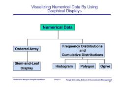
Statistics for Managers Using Microsoft Excel Chap 2-4 Tongji University, School of Economics & Management 2-4 Visualizing Numerical Data By Using Graphical Displays Numerical Data Ordered Array Stem-and-Leaf Display Histogram Polygon Ogive Frequency Distributions and Cumulative Distributions
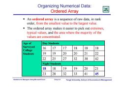
Organizing Numerical Data: Ordered Array An ordered array is a sequence of raw data,in rank order,from the smallest value to the largest value. The ordered array makes it easier to pick out extremes, typical values,and the area where the majority of the values are concentrated Age of Day Students Surveyed 16 17 17 18 18 18 College Students 19 19 20 20 21 22 22 25 27 32 38 42 Night Students 18 18 19 19 20 21 23 28 32 33 41 45 Statistics for Managers Using Microsoft Excel Chap 2-5 Tongji University,School of Economics Management
Statistics for Managers Using Microsoft Excel Chap 2-5 Tongji University, School of Economics & Management Organizing Numerical Data: Ordered Array An ordered array is a sequence of raw data, in rank order, from the smallest value to the largest value. The ordered array makes it easier to pick out extremes, typical values, and the area where the majority of the values are concentrated. Age of Surveyed College Students Day Students 16 17 17 18 18 18 19 19 20 20 21 22 22 25 27 32 38 42 Night Students 18 18 19 19 20 21 23 28 32 33 41 45
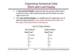
Organizing Numerical Data: Stem-and-Leaf Display A stem-and-leaf display organizes data into groups(called stems) so that the values within each group(the leaves)branch out to the right on each row. The stem-and-leaf display is a valuable tool for organizing a set of data and understanding how the values distribute and cluster over the range of the observations in the data set. Age of College Students Day Students Night Students Stem Leaf Stem Leaf 167788899 8899 20012257 2 0138 328 3 23 42 4 15 Statistics for Managers Using Microsoft Excel Chap 2-6 Tongji University,School of Economics Management
Statistics for Managers Using Microsoft Excel Chap 2-6 Tongji University, School of Economics & Management Organizing Numerical Data: Stem-and-Leaf Display A stem-and-leaf display organizes data into groups (called stems) so that the values within each group (the leaves) branch out to the right on each row. The stem-and-leaf display is a valuable tool for organizing a set of data and understanding how the values distribute and cluster over the range of the observations in the data set. Stem Leaf 1 67788899 2 0012257 3 28 4 2 Age of College Students Day Students Night Students Stem Leaf 1 8899 2 0138 3 23 4 15
Organizing Numerical Data: Frequency Distribution The frequency distribution is a summary table in which the data are arranged into numerically ordered class groupings. You must give attention to selecting the appropriate number of class groupings for the table,determining a suitable width (or class interval)of a class grouping,and establishing the boundaries of each class grouping to avoid overlapping. To determine the width of a class interval,you divide the range (Highest value-Lowest value)of the data by the number of class groupings desired. The main advantage of this summary table is that the major data characteristics can become immediately clear. Statistics for Managers Using Microsoft Excel Chap 2-7 Tongji University,School of Economics Management
Statistics for Managers Using Microsoft Excel Chap 2-7 Tongji University, School of Economics & Management Organizing Numerical Data: Frequency Distribution The frequency distribution is a summary table in which the data are arranged into numerically ordered class groupings. You must give attention to selecting the appropriate number of class groupings for the table, determining a suitable width (or class interval) of a class grouping, and establishing the boundaries of each class grouping to avoid overlapping. To determine the width of a class interval, you divide the range (Highest value–Lowest value) of the data by the number of class groupings desired. The main advantage of this summary table is that the major data characteristics can become immediately clear
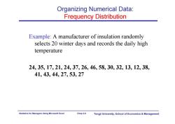
Organizing Numerical Data: Frequency Distribution Example:A manufacturer of insulation randomly selects 20 winter days and records the daily high temperature 24,35,17,21,24,37,26,46,58,30,32,13,12,38, 41,43,44,27,53,27 Statistics for Managers Using Microsoft Excel Chap 2-8 Tongji University,School of Economics Management
Statistics for Managers Using Microsoft Excel Chap 2-8 Tongji University, School of Economics & Management Organizing Numerical Data: Frequency Distribution Example: A manufacturer of insulation randomly selects 20 winter days and records the daily high temperature 24, 35, 17, 21, 24, 37, 26, 46, 58, 30, 32, 13, 12, 38, 41, 43, 44, 27, 53, 27
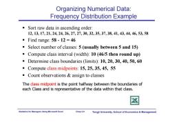
Organizing Numerical Data: Frequency Distribution Example Sort raw data in ascending order: 12,13,17,21,24,24,26,27,27,30,32,35,37,38,41,43,44,46,53,58 ■Find range:58-12=46 Select number of classes:5(usually between 5 and 15) Compute class interval (width):10(46/5 then round up) Determine class boundaries (limits):10,20,30,40,50,60 Compute class midpoints:15,25,35,45,55 Count observations assign to classes The class midpoint is the point halfway between the boundaries of each Class and is representative of the data within that class Statistics for Managers Using Microsoft Excel Chap 2-9 Tongji University,School of Economics Management
Statistics for Managers Using Microsoft Excel Chap 2-9 Tongji University, School of Economics & Management Organizing Numerical Data: Frequency Distribution Example Sort raw data in ascending order: 12, 13, 17, 21, 24, 24, 26, 27, 27, 30, 32, 35, 37, 38, 41, 43, 44, 46, 53, 58 Find range: 58 - 12 = 46 Select number of classes: 5 (usually between 5 and 15) Compute class interval (width): 10 (46/5 then round up) Determine class boundaries (limits): 10, 20, 30, 40, 50, 60 Compute class midpoints: 15, 25, 35, 45, 55 Count observations & assign to classes The class midpoint is the point halfway between the boundaries of each Class and is representative of the data within that class
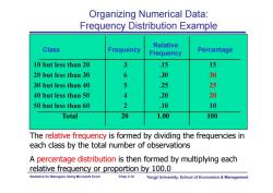
Organizing Numerical Data: Frequency Distribution Example Relative Class Frequency Frequency Percentage 10 but less than 20 3 15 15 20 but less than 30 6 .30 30 30 but less than 40 5 25 25 40 but less than 50 4 .20 20 50 but less than 60 2 .10 10 Total 20 1.00 100 The relative frequency is formed by dividing the frequencies in each class by the total number of observations A percentage distribution is then formed by multiplying each relative frequency or proportion by 100.0 Statistics for Managers Using Microsoft Excel Chap 2-10 Tongji University,School of Economics Management
Statistics for Managers Using Microsoft Excel Chap 2-10 Tongji University, School of Economics & Management Class Frequency 10 but less than 20 3 .15 15 20 but less than 30 6 .30 30 30 but less than 40 5 .25 25 40 but less than 50 4 .20 20 50 but less than 60 2 .10 10 Total 20 1.00 100 Relative Frequency Percentage Organizing Numerical Data: Frequency Distribution Example The relative frequency is formed by dividing the frequencies in each class by the total number of observations A percentage distribution is then formed by multiplying each relative frequency or proportion by 100.0
按次数下载不扣除下载券;
注册用户24小时内重复下载只扣除一次;
顺序:VIP每日次数-->可用次数-->下载券;
- 同济大学:《应用统计学》课程电子教案(课件讲稿)Chapter 1 Introduction and Data Collection(Applied Statistics).pdf
- 同济大学:《应用统计学》课程教学资源(试卷习题)考核试卷(B卷)2011-2012学年第2学期(无答案).pdf
- 同济大学:《应用统计学》课程教学资源(试卷习题)考核试卷(A卷)2011-2012学年第2学期(无答案).pdf
- 新乡医学院:《卫生统计学》课程教学资源(课件讲稿,打印版)实验五 统计表与统计图.pdf
- 新乡医学院:《卫生统计学》课程教学资源(教案讲义,打印版)实验五 统计表与统计图.pdf
- 新乡医学院:《卫生统计学》课程教学资源(课件讲稿,打印版)实验四 卡方检验.pdf
- 新乡医学院:《卫生统计学》课程教学资源(教案讲义,打印版)实验四 卡方检验(教师:晁灵).pdf
- 新乡医学院:《卫生统计学》课程教学资源(课件讲稿,打印版)实验三 方差分析实验.pdf
- 新乡医学院:《卫生统计学》课程教学资源(教案讲义,打印版)实验三 方差分析.pdf
- 新乡医学院:《卫生统计学》课程教学资源(课件讲稿,打印版)实验二 总体均数的区间估计假设检验(t检验).pdf
- 新乡医学院:《卫生统计学》课程教学资源(教案讲义,打印版)实验二 总体均数的区间估计假设检验(t检验).pdf
- 新乡医学院:《卫生统计学》课程教学资源(课件讲稿,打印版)实验一 计算器使用和计量资料描述(定量资料的统计描述).pdf
- 新乡医学院:《卫生统计学》课程教学资源(教案讲义,打印版)实验一 计量资料描述和计算器使用.pdf
- 南京农业大学:《生物统计与试验设计实验》课程教学大纲.pdf
- 南京农业大学:《统计实习》课程教学大纲.pdf
- 《物流经济学》课程电子教案(PPT教学课件讲稿,共十二章).pptx
- 中国科学技术大学:《应用时间序列分析》课程教学资源(课件讲稿)第六章 多元时间序列分析.pdf
- 中国科学技术大学:《应用时间序列分析》课程教学资源(课件讲稿)第五章 非平稳序列的随机性分析.pdf
- 中国科学技术大学:《应用时间序列分析》课程教学资源(课件讲稿)第四章 非平稳序列的确定性分析.pdf
- 中国科学技术大学:《应用时间序列分析》课程教学资源(课件讲稿)第三章 平稳时间序列分析.pdf
- 同济大学:《应用统计学》课程电子教案(课件讲稿)Chapter 3 Numerical Descriptive Measures.pdf
- 同济大学:《应用统计学》课程电子教案(课件讲稿)Chapter 4 Basic Probability(主讲:王世进).pdf
- 同济大学:《应用统计学》课程电子教案(课件讲稿)Chapter 6 The Normal Distribution and Other Continuous Distributions.pdf
- Chapter 7 Confidence Interval Estimation.pdf
- 同济大学:《应用统计学》课程电子教案(课件讲稿)Chapter 8 Fundamentals of Hypothesis Testing(One-Sample Tests).pdf
- 同济大学:《应用统计学》课程电子教案(课件讲稿)Chapter 9 Two-Sample Tests with Numerical Data.pdf
- 同济大学:《应用统计学》课程电子教案(课件讲稿)Chapter 10 Analysis of Variance(ANOVA).pdf
- 同济大学:《应用统计学》课程电子教案(课件讲稿)Chapter 11 Simple Linear Regression.pdf
- 同济大学:《应用统计学》课程电子教案(课件讲稿)Chapter 12 Time series based Demand Management.pdf
- 同济大学:《应用统计学》课程电子教案(课件讲稿)Chapter 13 Statistical Applications in Quality Management.pdf
- 同济大学:《应用统计学》课程电子教案(课件讲稿)Chapter 5 The Normal Distribution and Sampling Distributions.ppt
- 《概率论与数理统计》课程教学资源(整理资料)Matlab在统计方面的应用.pdf
- 《概率论与数理统计》课程教学资源(整理资料)正态分布的前世今生.pdf
- 《概率论与数理统计》课程教学资源(PPT讲稿)概率论与数理统计知识点总结.pptx
- 西安电子科技大学:《随机过程概论》课程教学资源(课件讲稿)Chapter 4 随机过程通过线性系统.pdf
- 西安电子科技大学:《随机过程概论》课程教学资源(课件讲稿)Chapter 9 检测理论.pdf
- 沈阳航空航天大学:自动化学院《误差理论及数据处理》课程教学大纲.pdf
- 吉林大学:《医学统计学》课程电子教案(PPT课件)第一章 医学统计中的基本概念、第二章 平均水平(集中趋势)的统计描述(主讲:田迎春).ppt
- 吉林大学:《医学统计学》课程电子教案(PPT课件)第三章 离散趋势的统计描述、第四章 抽样误差与假设检验.ppt
- 吉林大学:《医学统计学》课程电子教案(PPT课件)第五章 t检验、第六章 方差分析、第七章 相对数及其应用.ppt
